.: Can't Even Get the Special Edition Right
In August of 1997, the Special Edition of the Star Wars trilogy was released on video, in VHS and Laserdisc. The Special Edition looked and sounded pretty good in theatres, even if some complained it wasn't as vibrant as their memories of it from 1977 are (print vibrancy also depends on projector bulb intensity, and some theatre owners turn it down to extend the bulb lifespan). On video, it looked okay for its time, although the home video telecine of A New Hope has a very noticeable pink shift (you can tell it is in the telecine and not the print because the CG scenes have it). The Dolby Digital 5.1 mix on the Laserdisc is still one of the best ways possible to hear the original film. Then, in early 2003, Lucas began readying the films for DVD, where he wanted to re-treat them. Picture sharpening and grain and dirt removal were accomplished courtesy of Lowry Digital Imaging, plus completely new colour timing was provided along with a bevy of additional picture and audio changes. Fine. So, what's the problem with this release?
The problem isn't that Lucas put Hayden Christensen in Return of the Jedi, or that he overdubbed Jason Wingreen's iconic Boba Fett, as much as many detest these additions. I don't mind all the Special Edition changes, personally, some of them are quite interesting as an alternate take on the films, and the colder, high-contrast colour palette that was instigated here gives the films a very slick, modern look, and the super-clean picture quality makes the films look brand new. However, the 2004 releases are probably among the worst digital masters I've ever seen on titles as big-ticket as these. Not only that, these new editions introduced problems and glitches that were never there previously. If you've never noticed that Luke has a green lightsaber in A New Hope or that Vader's frequently is pink, then you've probably been asleep when the film is on. But these are just the tip of the iceberg.
What's Wrong With This Picture?
When I first watched the 2004 Special Editions, I was seduced by the clear and sharp picture, and the vibrant colours, but as soon as one looks closer you can see that something is seriously wrong.
1) Crushed black levels
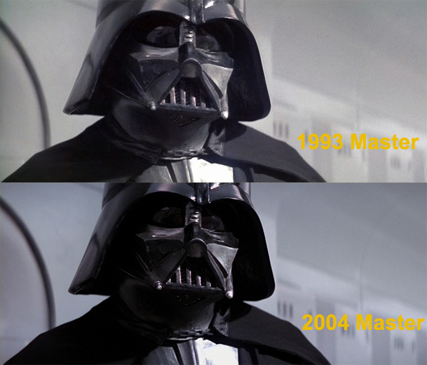
Today, digital technology has resulted in a trend towards high-contrast imagery. In order to get really dark blacks, the black levels are "crushed" while the contrast is greatly increased to get a "snappier" image which "pops" and looks crisp. The result is that when taken too far you eliminate all the mid-range detail and erase all the low-level detail. Things are either very dark or very white, instead of having a full tonal range of in-between grey shades. Mike Verta has written about this problem on his page (although he's probably wrong about Lowry's responsibility and the "rushed" hypothesis to explain the faults; more on this later). But to illustrate this, below is a comparison of the 1993 master and the 2004 master. Notice the shadow levels in Vader's helmet, and the shadow cast on his cape, which do not display information in the 2004 master, as well as the dimmed down background.
Now, that's a example that not everyone has an eye to catch, because it's a bright scene to begin with. Here's what happens when you have an environment that is already dark:
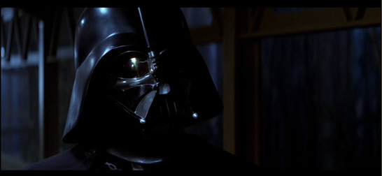
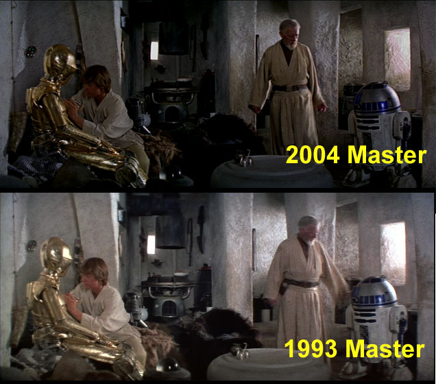
Notice how the black levels have become so deep that they've swalled up all the picture information in the shadows. In fact, most of Darth Vader's face does not have discernable detail left in it. There simply isn't picture information in the darks to recover--it has been "crushed" to non-existance. The new "look" here is attractive in theory, to have Vader's face be half-buried in shadow, but the levels have been pushed way too far. Another typical example of this can be seen below. Notice how the set detailing in the centre is no longer visible, especially the fur chair covering behind Kenobi. There simply isn't picture information left in the black levels, which have been brought down far too hard.
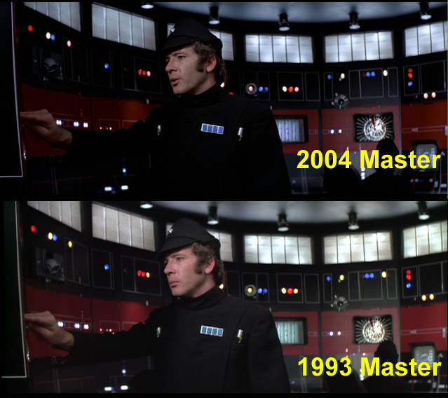
Below, notice how the officer's shirt has become a nearly formless black blob, and detail throughout the room is reduced by the black levels. The original levels, as seen by the 1993 master, are much more natural:
Along similar lines, what happens to the fine details on an otherwise all-black surface? Those details get bled over by the contrast and black levels. An example would be...
2) Erased Starfields
The starfields. The films are called "Star Wars", but the 2004 release might be re-titled "Dark Matter Wars". The stars have often either been dialed out in brightness or erased completely in the worst instances. Some have even theorized that Lowry's dirt-removal program erased some of the stars, thinking they were dirt, but it's probably just because of the black levels; they wanted to have the blackness of space be total, crushed black, and it took the stars with it. Here's some before and after shots:
3) Image dimness
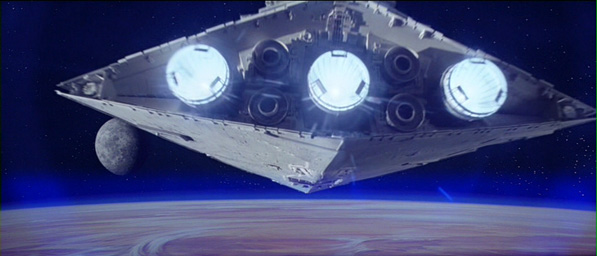
Despite having greatly increased contrast compared to the original photography, the 2004 image still looks dim in many shots. In addition to crushing the blacks, the whites have been dialed down too, and the image overall has a milky, dim quality that lacks the luminance a modern transfer should provide. You can see this in the lightsaber cores, but we'll get to that issue in a bit. Let's take that opening stardestroyer shot, for example. Here it is in the 1993 master:
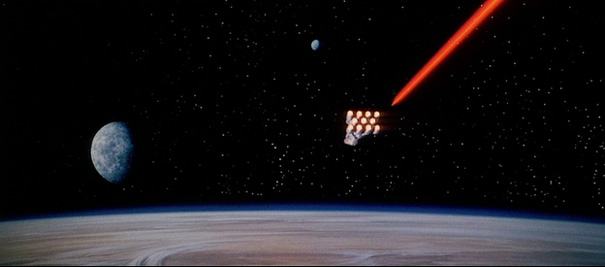
And here it is playing on a theatre screen in 1977. It hasn't exposed properly in photographing the screen but you get a rough sense of it I think:
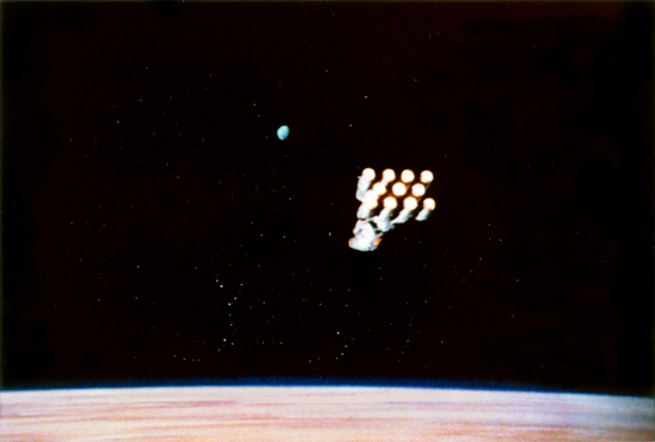
Now, with all of that in review, here it is on the 2004 DVD.
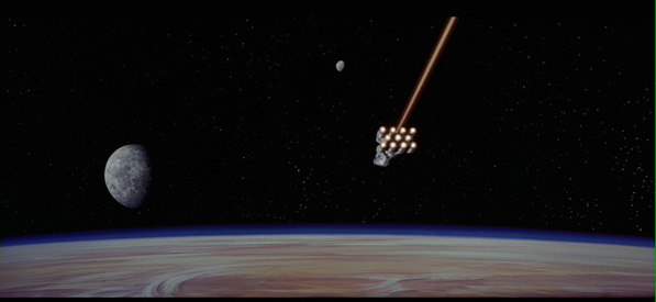
Look at the white levels, on the planet atmosphere, in the stars, in the engines, in the lazer core. Things that should have luminance to them are dim and grey-toned. It looks like someone put dulling spray on the screen. Let's do a little experiment. What if we take the above screenshot and bring up the light levels to normal settings, so that the blacks aren't so crushed. This is just a rough mock-up but here is basically what you get:
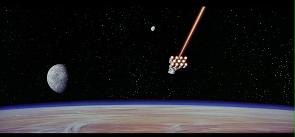
By uncrushing the blacks and raising the image brightness levels, the stars are back to life, more detail shows, and there's even colour appearing in the engines and lasers again (we'll address that issue separately). Watching the DVD is basically like looking at this proper image with sunglasses on. Not every shot and scene is this bad, to be fair, but many entire scenes are. Such as the cantina scene. Now, it's one thing to grade the film to look dimmer; but this involves playing with the curves in such a way that the image retains proper luminance and definition. In the cap below, you can see how murky the image is (Han's face hardly can be seen). Look at the light in the middle of the table.
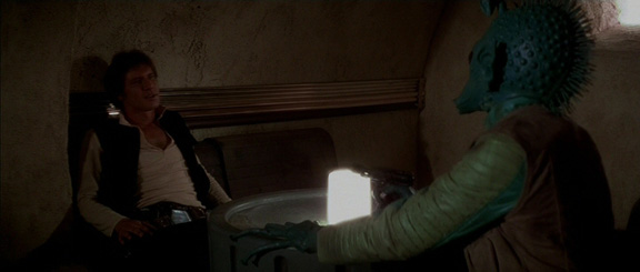
A light does not illuminate quite like that. What has happened is that the image has had just the brightness turned down, which turns the white levels to grey, but this is not the same as manipulating an image to be dark, so that it retains appropriate contrast and luminance levels. Instead, digital sunglasses have been put over the picture. It looks like what they did was first increase the contrast to get it punchier and better defined, and then dial down the brightness, which dimmed all the whites. Below is how the scene was timed for the 1993 release, with proper luminance. The master does not have the greatest contrast and saturation, but you can see how much more natural the light levels look.

4) Weird Colour Casts
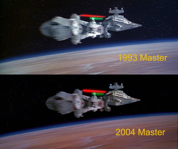
The films have really weird color casts to them, and not just the intentional ones. Yes, Hoth is supposed to be blue-toned, I'm fine with that. But here is what the white Blockade Runner looks like in the 1993 and 2004 masters. Notice anything?
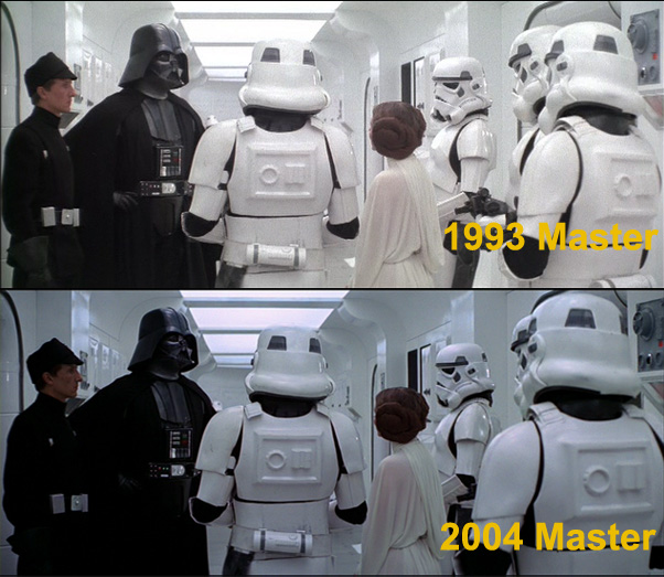
Now, you have that image dimness I was talking about, plus the crushed black levels (check out Vader and the guy beside him), plus what was supposed to be Kubrickesque-white now has blue in it, which makes the skintones look pink (see: lobsterman, coming in a minute). Think maybe it was intentional? Well, here is how Lucas coloured the exact same ship in Revenge of the Sith, released the year afterwards, and which he had already filmed the year before the 2004 release:
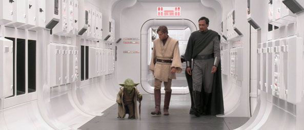
Unsurprisingly, it looks exactly like it has in every single release except for the 2004 master. Such errors affect other scenes as well. Such as the green colouring on the Millennium Falcon here:

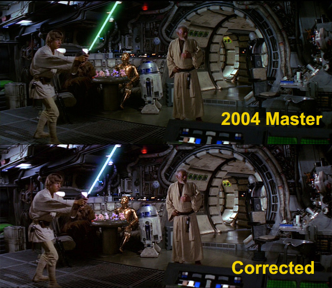
You probably can't take your eyes off that magical green lightsaber, but the whole shot has been subtly shifted to green. It seems more noticeable when you can see a version of it that looks normal, which I why I have been doing side-by-side comparisons. Here is a version I corrected myself. Look back at the 2004 version, then to the corrected version, then back again. See the green? Look at the beige wall panels of the ship, or Luke and Ben's robes.
There are many other examples in the film, which aren't quite as obvious. The example below has a bevy of weird colour details. For starters, the black levels have been crushed, erasing all the midrange information and fudging out many of the background details. If you look at the righthand section, the image has been red shifted and blue shifted, which makes R2D2 have mild purple-looking cast to him, though the wall has a mild blue cast too. Most noticeable, of course, is the outdoor, sunlight-lit section with Luke, which is noticeably green shifted again. I did my own quick mockup of how a corrected version might look, to demonstrate the severity of the miscolouring.
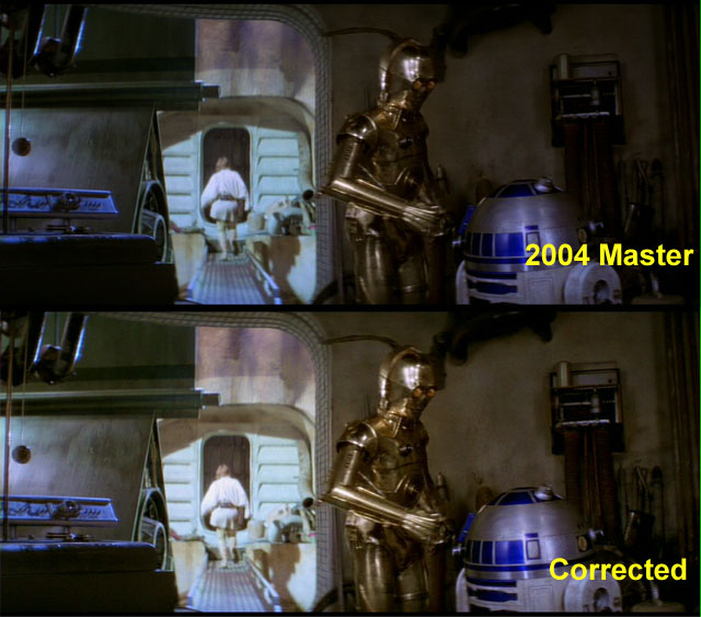
What caused this? Poor judgement on the colourist, I suppose, but a lot of it has to do with the crushed black levels--the colour casts you see above were already there to some degree, but when the black levels are brought down that hard, the colouring begins to take on different characteristics. But this is simply compounded by....
5) Oversaturation
In an attempt to get the films to look vibrant, the saturation has been jacked way up. As a result, any mild casts that were there originally get exaggerated to the point where they are a distraction. The original Falcon shot might very well have had some green in it, but when the saturation is increased, the scene becomes coloured in a way that it never would have been naturally. This oversaturation affects skin tones as well. Here is an example:
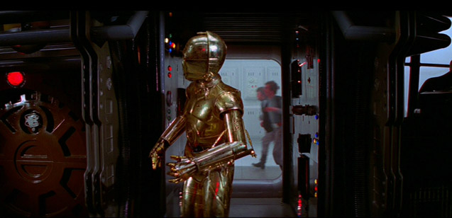
Notice anything wrong? Take a look at lobster man in the background. Instead of a normal skin tone, the colour-shifting and exaggerated saturation have turned him into the worlds worst rosacea victim. Pumping up the saturation so unnaturally also makes things "pop" distractingly, like the coloured lights above, which are bleeding slightly. Below is another example. The bright blue lid of the escape pod jumps off the screen so greatly that it's the first thing your eye goes to. It was always there and always vibrant, but never to such extent.
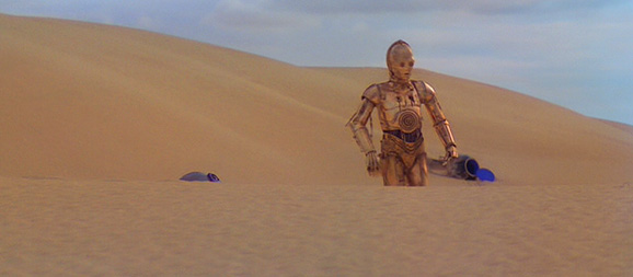
In other shots, colour fluxuation causes poping, such as the copper and gold colour mix on 3P0s coating, and patches of colour variation in the desert sand. It also looks to me that a lot of video noise in the transfer has been brought out by all the oversaturation. Maybe this was all unavoidable due to the way in which the negative has faded, as the recovered colour might not saturate equally, but this seems to be a problem that other films from the period have avoided.
6) Colourless engines and lasers
This brings us to one of the most confounding examples. Given the previous point, you would think that brightly coloured things like engine glows and laser blasts would be overpoweringly vibrant, right? Well, as we already saw, here's how the opening shot looks on the 2004 master. Notice the lasers and the Blockade Runner engine.

This clearly was not an intentional artistic choice, as it seem to vary from shot to shot depending on how it was recoloured. It affects the blue engine glow of the Falcon sometimes, and the X-wings too. Don't ask me to explain why. It only happens in certain shots. The blue of the star destroyer engine in that opening shot clearly wasn't affected. In fact, because of the oversaturation when it flares the lens the whole screen goes blue.
7) Really badly done lightsabers
Finally, the thing that is most noticeable: the lightsabers have accidentally been recoloured in some shots. First, the white cores have been dimmed down. In the example below, it reveals some of the compositing flaws that you were never supposed to be seeing in the first place (look at the point where they cross) because that centre point ought to be brilliant white:
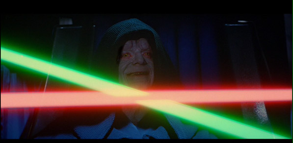
In fact, in that example, the white cores aren't just diminished, they don't even have cores at all.
But secondly, of course, they are not the correct colours. We've already been over the instance in A New Hope where Luke's saber turns completely green for a shot. And in the shot above...well, obviously that lightsaber isn't red. It's a form of pink. The Vader duel in A New Hope is not that bad but you still have shots like this.
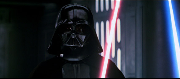
Maybe Vader is trying to show more of his feminine side, but probably this isn't supposed to look like that. It's extra distracting because one shot is screwed up, then the next shot is fine, then the next shot is not, and the variation fluxuates between being really noticeable and being a bit forgiveable, but even in the best cases you still notice that it is there. The lightsaber colouring problem is found throughout the films, with Empire Strikes Back being the worst offender. It only seems apparent in the first section of the duel, in the freezing chamber, but it's enough to deflate the serious epicness of the scene. As a reminder, here is how the scene is roughly supposed to look, taken from the 1993 master:
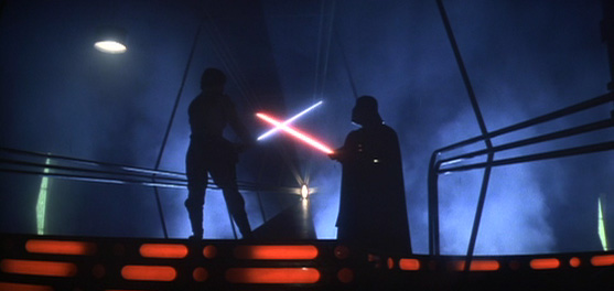
Here are some choice examples from the "improved" picture on the 2004 release. Aside from the deliberately exaggerated blue tint, pay attention to the dimmed lightsaber cores (it might not look obvious--but when you compare against the cap above you really see the difference), as well as crushed blacks plus of course Vader's candy coloured blade:
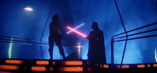
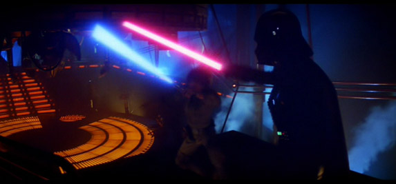
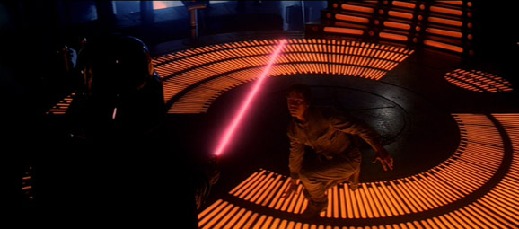
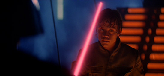
You get the idea. This one shot strangely has the saber a weird orange-yellow.
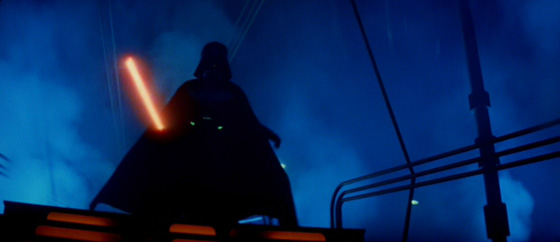
How did this happen? I'm not entirely sure, but part of it might be because the saber colours were always inconsistent. Vader's saber changes from true red to a light red to an orangy-red from shot to shot, but you never noticed it because it was very mild. With the colour exaggeration and the dimness issues and all the other image manipulation that went on, these went from mild variation to outright total recolouring, despite the fact that the lightsabers were equally vibrant in earlier versions. At least, that's my explanation. It doesn't explain why they weren't fixed, of course. See this page for a full listing of lightsaber goofs in A New Hope alone.
Also, in A New Hope, there is a moment where it seems as if Obi Wan's sabre is shorting out. It looks like they tried to fill it back in:
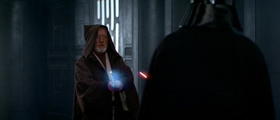
Now, I realize that in the original version, there wouldn't be anything on the sabre at all. But when you have ILM at your disposal to fix this would it really have killed them to put an actual lightsaber there, the way twelve-year-olds do in their fan-films?
Does This Sound Right To You?
As bad as all of this is, it doesn't stop with the visuals. The sound mix to Star Wars is pretty glaring too.
1) Too much bass, sloppy fading and really loud surrounds.
Simply put, the mix is the equivalent of the crushed black levels and oversaturation in the picture: to get it to sound "punchy", the bass has been upped to the point where it sounds unnatural and distracting in some instances, and the surrounds are unusualy loud too. You can also hear the dialogue levels being faded up and down. Listen to the dinner conversation between Luke and his aunt and uncle, for example. As a result of all these factors, the mix simply doesn't sound as good as it should--unlike, say, the 1997 5.1, which sounds even better once you have heard this one.
2) The surround levels have been swapped
While the above may have simply been misguided preference, here we come to the main complaints. In certain areas of the film, the left and right channels have been accidentally reversed in a few shots, which can be very disorienting at times. This is a flagarant error. So, you'll have violins coming at you from the left-rear and right-front, with dialogue and explosions on the right-rear and left-front. I imagine this must be how it would sound while listened to in the spatial warp of a black hole. Well, sound doesn't exist in space, but you get the idea.
3) The music is gone
The music is also frequently dialed down so as to be buried under the sound effects; this is less apparent in the stereo mix but it's noticeable in the 5.1 version. In the worst instances, it is totally gone. Particularly noticeable is the memorable swell during the very first dive towards the Death Star, which now simply isn't there, whether in stereo or Dolby Digital. Like the swapped channels, it looks like they accidentally dropped the music track here.
Empire and Jedi fare better, but they too suffer from louder surrounds and bass-heaviness. The 1997 Laserdisc mixes of all the films remain as the best 5.1 version available.
Who Is Responsible For All Of This?
For the sound mix, one might point to this man:
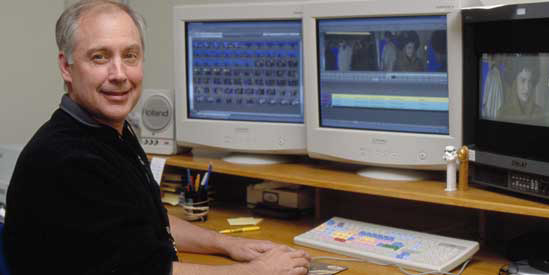
But also his protege, Mathew Wood. With regards to Ben Burtt, although a brilliant sound designer as a mixer he has a history of putting the sound effect levels way above the music (I wonder why?). In fact, there is a very amusing moment in the Episode III documentary Within A Minute. George Lucas is spotting the mixing session and Burtt keeps trying to get the sound effects to drown out the music, to the frustration of the mixer; eventually the mixer points out that if the music is that low you might as well not even have it. Burtt, who has lost the debate, sinks in his chair ever so slightly. But Burtt was supervising this one, and his protege actually performed the mix. Guess the apple doesn't fall far from the tree. This doesn't explain all the other problems though, like the noticeable dialogue faders, extra-loud surrounds and extra bass, unless we can just chaulk it up to bad decisions or a lack of experience. Of course this still doesn't explain the swapped channels and missing music sections.
As to picture responsibility...
Lowry is often pointed to as the culprit of all of this. They are often blamed for tampering with the films and screwing up the picture with their processing. Mike Verta's editorial on the release hypothesizes this, for example. This seems unfair--and untrue, as far as I can tell. Lowry had little to do with the colouring of the films. At most, they may have eaten up some of starfields, but in my opinion that issue is simply due to the crushed black levels. You can also tell from before and after images that the colouring was unaffected--and also that the colouring issues were there when Lowry received the footage. Below is a before-and-after image from Lowry itself featuring the popping oversaturation, for example:

So, I don't believe they are at fault. However, possibly some of the image dimness, for instance in lightsaber scenes, is in part due to them. This is because they were responsible for smoothing out density fluxations, especially problematic in optical composites, which was accomplished by "evening out" the contrast levels. However, whenever they did this they sent it back to ILM to colour-correct it again, knowing that the image would (or could) have had its levels changed a bit, whereupon it was re-tweaked and approved. That this dimness is a problem throughout also shows that it wasn't Lowry overall who did this, but that it is stylistically part of the entire digital intermediate. So then, who is to blame for the colour-timing? The supervisor. This guy.
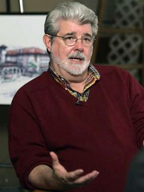
George Lucas personally supervised the colour timing himself from Skywalker Ranch, where it was performed in-house by ILM. A New Hope was also outsourced, and the footage was sent to Lucas for review, where he would give additional notes. Finally, the finished color-timing was screened for him for his ultimate approval. From here, the colour-corrected version was given to Lowry Digital Imaging for their dirt-removal, where Lucas again supervised, gave input and then approved of the total, finished product. See this article for further detail. Lucas was very involved in overseeing the picture treatment. The press release by Lucasfilm even extolls the virtues of colour correcting it in-house at ILM with George's involvement to get it exactly the way he wanted.
So what the hell happened? Did he fall asleep during the screenings? I don't know. He screened the final master of the films with Rick McCallum as well, and he's also screened them since, such as at his AFI tribute a few years ago. The simple truth may be that Lucas just has really bad judgement (meaning that he just didn't notice). During this time he had, after all, figured out how to put Hayden Christensen and Jar Jar Binks into Return of the Jedi. It seems hard to believe, but after studying the restoration and Special Edition processing, this is the best answer I can give. After all, if the films were supposed to look completely different, with these being the "definitive" versions, how could Lucas have possibly not blocked the release when he is so notoriously controlling of the films? And if somehow this escaped his notice, wouldn't he, upon screening the master all those subsequent times, have immediately recalled the releases and got straight to work on getting the corrected version out there? But, no, such is not the case. The uncomfortable picture that gets built is that all is as Lucas made it. Since the pink and green sabers were clearly not intentional, I have to believe he just wasn't paying attention.
Why didn't anyone say anything? Surely anyone that saw the new films and saw Vader holding a pink lightsaber or the cool blue Blockade Runner hallways knew that serious technical errors had been made. I guess, when you are Lucas and you put yourself in an environment in which you are not to be questioned, no one actually questions you. Make no mistake, everyone down from the ILMers to the Lucasfilm corporate marketing guys, the people that actually saw this, had to have known what had happened but no one wanted to rock the boat, because Lucas had personally okayed all of this (more than once, too). And so the emperor's new clothes looked great.
I've seen people try to argue that the release was rushed and that's why it is so bad. To this I have to say: it doesn't excuse the shoddy workmanship. Even were that true, these are bad enough to demand a recall, not multiple re-releases and denial (we'll see this in a minute). But secondly, even professionals in a "rushed" state should not have given Vader a pink lightsaber. It's not hard to fix. The problem is that Lucas asked for the scenes to be darkened to the point where blacks were getting crushed and the sabers dimmed down, and he wanted the saturation increased and colours manipulated to the point where things didn't look natural anymore. So when ILM follows his instructions and comes back with a shot where Vader's lightsaber has become a solid pink blob, thinking he'll realize why this kind of colour grading is not a good idea, imagine their shock when Lucas gives it his seal of approval. But that, I must assume, is how it happened. And once that happened, no one could say anything.
But more importantly: this release was not rushed. Work began in 2003, and Lucas took his time tweaking, re-tweaking and re-approving the picture manipulation. A year and a bit is more than an adequet timeframe. For example, the super-mega-deluxe 9-disk Alien Quadrilogy boxset, in my opinion the most elaborate set the DVD age ever produced, was made in about the same amount of time, as covered in Digital Bits' book. It is also defended by some that Lowry had to rush through the films and that's why they screwed them up. First of all, there's no evidence that Lowry screwed them up, except for reducing the grain a bit but that was at Lucas' request. But secondly, Lowry had to go through a month cleaning each film in early 2004 because that is how much time it took. It was a big job, yes, but there was no "last minute" rush to get this DVD ready that it produced all of these problems. Bonus material and interviews were conducted in 2003, while Lucas re-timed the film, and in early 2004 the material made its last stop to Lowry after which the DVD was authored for its late 2004 release. It's the normal amount of time for a release of this elaborateness--which, at one bonus disk for all three films, isn't very elaborate compared to most deluxe releases. Any of these sort deluxe projects are hectic and pressured, that is the nature of the home video business, and this is on par for similar releases as far as I can tell.
The DVD set was released in 2004 and viewers started complaining immediately. Lucasfilm then issued a press release saying they were "deliberate artistic choices," in other words denial. To look at an alternate scenario, when Back to the Future came out on DVD in 2003, Universal cropped it's aspect ratio incorrectly, and so they set up a recall; earlier in the year, Gladiator came to Blu-ray, riddled with DNR, and so an exchange program for a new transfer with all the detail and correct colouring was set up by Sony after enthusiasts complained. The Star Wars trilogy, on the other hand was re-released in 2005 in another boxset that used the exact same transfers. The same transfer then began to appear on TV in a hugely-hyped Spike-TV network deal. Then the exact same transfer began making the rounds on TV in high-definition. Then it was re-released on DVD in 2006, again in the same transfer. It has since been screened at numerous big-ticket venues, including Celebration IV and an AFI screening. Lucas must be very proud of it.
As a result, it's hard to even appreciate the merits that the Special Edition might have. And with the original theatrical versions available only as Laserdisc versions, this really means that there is no good quality official transfer of any of the films, which is pretty sad. Lucasfilm couldn't even get the Special Edition right.
What will be even more amazing is when the next "edition" comes out. If the colours are corrected, to one degree or another (even if it is just the lightsabers), then it's admission that the previous release was defective after all. And you get people to buy the same thing twice, just to have the problems they introduced on your last purchase fixed. If the colours remain as they are here, then we're still in the scenario where there's no actual high quality version of the original trilogy. Either way, it seems like viewers are on the short end of the stick.
Afterword: What is more, the Special Edition version here was only scanned from the film negatives at 1080p. This is to be the new digitial master for the films, and all of the new ILM work was done from this scan. So, if you ever see the films in theatres again, it will be from 1080 lines of resolution, never mind a 2K scan (I guess an 8K scan is just crazy talk at this point). But seeing as Lucas shot his second two prequel films in this same resolution, I guess he really doesn't mind, or notice, the quality difference. I would believe that.