.: GOUT, Automated Theatrical Colouring, and a Reference Guide
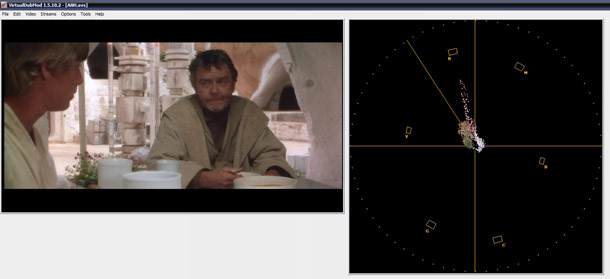
I've spent a lot of time researching the original theatrical colouring of the films. I've looked at stills, various transfers, archival documents, theatrical bootlegs, reports and scans from various prints. So, I originally started this page with the intention of providing a reference guide for the theatrical colouring. People sometimes say, "Why? We have the 2006 theatrical version DVD." That's the problem. The 2006 DVD--nicknamed the GOUT--is not a very useful reference source. As you will see, the 2004 DVD set is actually a better indicator of colour a lot of the time. This is because the GOUT is so washed out that as much as 60% of its colour simply isn't there. This is the reason why everything is neutral colours: Tatooine is a pale beige, the Death Star a consistent grey, Hoth a neutral white, Bespin grey again, etc. The original films are actually quite vibrant, and this is one thing the SE videos attempted to portray, albeit with some major caveats as everyone knows. One way you can really see how washed out the GOUT is is by looking at the skin tones. Below are two examples from Star Wars comparing the Technicolour print to the GOUT, just to illustrate this:


This is not a perfect example because it is a photograph of a theatre screen, but you get a sense of it. Other, perhaps better examples, can be found at the page on the Technicolor print here:
http://savestarwars.com/technicoloribscreening.html
In fact, in some shots the Technicolor print looks like it is a bit washed out, or perhaps this is due to varying technical issues with the camera's automated settings. Anyway, this is the reason why the Death Star, which is green or blue in most--but not all--shots always appears grey in the GOUT. It's just so desaturated. Once you see the films they way they should be seen, the GOUT looks downright black and white.
"Doctor M" provided me with some waveform shots to illustrate how little colour information is on the GOUT, using the Technicolor print photos as a contrast. Here is the colour spectrum of a shot from the Technicolor print:

On the other hand, here is the colour information on the GOUT.
Only a pale shadow, and very shifted towards the red spectrum (the pie piece on the top left).
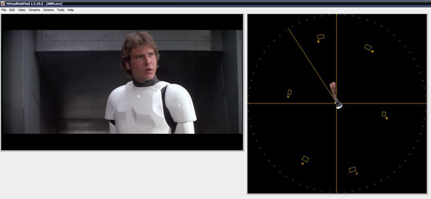
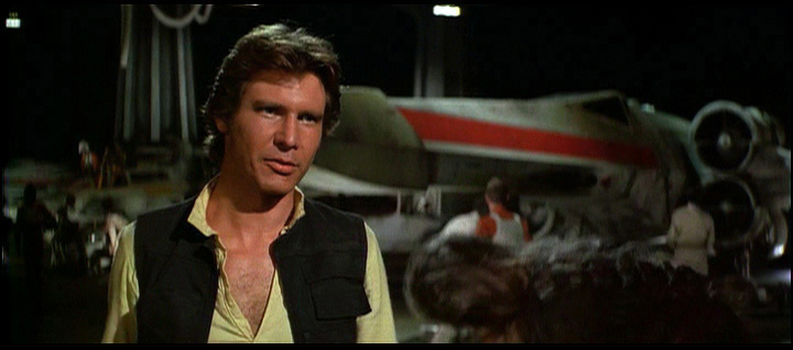
Here is the same shot of Han, from above. Below is the Technicolor cap:

Again, a fairly strong colour signal, and one that uses all of the spectrum. Here is the same shot on the GOUT:
You can see this in more tangible ways than graphs though. Here is a shot taken from a raw daily, as seen on the documentary Empire of Dreams. Of course, the contrast and exposure is not quite right, but pay attention to the colour richness:

Below is the same shot as it appears on the GOUT:
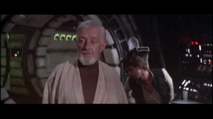
You can also see how flat the GOUT looks. This is what most people see when they want to see "the original version of the Star Wars films", but it's not a very good representative. This applies to Empire and Jedi as well.
I did, however, find a very cool way of getting around this. It's not perfect, but its approximate, and it's very simple that I am surprised no one has really done this before. All you need to do is ramp up the saturation in your player. When you do this something amazing happens: most of the colour information of the Technicolor print is actually hidden in the GOUT. All the colour is there! Some shots have some video noise, but the noise is in the washed-out GOUT too. So, if you want to see what the theatrical colours look like, you can just use the theatrical print that was telecined for the GOUT. You can do this in different ways but I did it in VLC, so that's what this guide will be based on, as I feel it is the most effective.
What you will need:
-GOUT DVDs
-VLC
That's it. First load the disc in VLC and start playing the film. Then go to tools and select filters. Go to video settings and do this:

These precise settings are not totally perfect, but they are in the ballpark. Drag the saturation to about where I have it. That's 90% of the work. The problem though is that the GOUT is red-shifted, so you end up with lobsterish skin tones. That's why I have taken the hue and just nudged it back, so the redness becomes tempered with cyan. You will have to experiment a bit because these settings are touchy, it is best to do so on a close-up because getting correct skin tones in a neutral scene sets the parameters for all the rest of the colours. Star Wars was difficult, as the setting you see above still have some red tones in certain shots whereas Empire was much easier; I suspect this is because SW had pinkened a bit more. I just did this as a quick pass and didn't spend a lot of time on it, but this is the way I had it set and the screencaps that follow on each page were done with this setting. The GOUT is very dull and flat, and benefits from a boost in contrast and brightness to get the image to pop a bit more. I did, however, go beyond VLC and automatically had photoshop dial down the red saturation by about 7 points for all the caps, but did not do any shot-by-shot correction, as I wanted this to be automated.
I also took the sharpness up, as you can see there. The sharpness dial is really sensitive but if you just nudge a bit, the GOUT looks a lot more detailed, because the thing is soft as hell. This was my own preference, but I highly recommend it.
Anyway, when you do that, this is what happens:
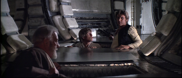

Here is the screenshot of Han from before:


Another example of the fairly radical change you get:

The shot looks something like this on the Technicolor print; I tried to correct the exposure from the camera a bit, but it's still very bright and washed out. However, imagining it without the exposure problem, it is not far from the above shot:

When you do this, you also discover a lot about the films; because of the added detail and contrast, you can see things in a clearer way, especially where the visual effects are concerned: flaws in the compositing really come out when you do this, so it is like seeing the original version in a new way. You also notice scratches, grain and other picture imperfections,
As mentioned, however, this method is not perfect, because the GOUT is not perfect. Strong primary colours tend to pop and bleed a bit, and once in a while you get noise issues, usually in lightsaber scenes. The noise is on the GOUT itself, in fact, it just becomes more obvious (it's a mix of grain and video colour noise); the popping and bleeding is mainly because of the age of the video transfer, and because certain colour spectrums will saturate easier than others and thus be slightly out of balance. This is also dependent on the GOUT's relative brightness settings for shots. Reds especially are very strong, and already pop a bit on the raw, uncorrected master (which is why I isolated the reds down). Sometimes these artifacts look a bit ugly, but this is the only way to retrieve the full, approximately correct colour levels, and they are usually very mild. The GOUT also re-coloured the binary sunset scene for Star Wars, which cannot be rescued using these settings, unfortunately. One unfortunate byproduct of the GOUT is that the general dimness for Star Wars crushed all the highlights in skintones; this is generally not a problem in wider shots, but closeups have a flat, over-coloured "tanned" look, resembling makeup. Here is a demonstration between the corrected GOUT, with Han's over-shaded face, and Puggo's 16mm print (mildly corrected), which has highlights and better tonality in the skin.


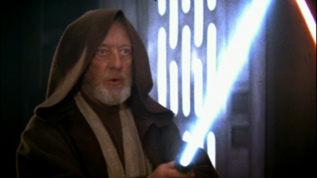
You can see this problem in the Obi Wan comparison between the raw GOUT and raw dailies, and the other Han comparison between the corrected GOUT and Technicolor.
Again, I must highlight that these are not 100% definitive, because some of red/purple skintones were not fully corrected and some shots might need their own correction levels for certain problems; also, stuff like the precise level of saturation and green-shifting is going to depend on individual eye and preference to some degree. However, the examples I give show you "basically" how the films would have looked. I encourage people to follow my lead and play around with the levels themselves. I must stress, however, that the films were quite vibrant and should look as such.
Linked at the bottom of this page are pages which show some comparison caps using the VLC automatic settings posted which bring back an approximate yet fairly accurate rendering of the theatrical colours. Some shots were chosen at my own whimsy, but some were chosen to demonstrate certain qualities. I have included additional sources to bolster the (approximate) accuracy of these, mainly additional print photos, theatrical bootleg VHS rips, and 8mm and 16mm sources, as well as others. In the case of the theatrical bootlegs, Empire's is in extremely good condition and shows the vibrancy quite well. If you look at some of the theatrical trailers, they show the original vibrancy as well. For instance:
However, the colours on the trailer don't always correspond to the way the final prints looked. This is because the trailers are readied long before the film is released (obviously) and so don't always reflect the colour timing of the answer print. This might lead to some confusion. There is a myth that the Empire didn't have the blue cast that the 2004 version gave to it, but it was in fact always there in lesser extremes. However, while this blue theme was in the photography, the colour timing on the original answer print exaggerated it. For example, here is a shot from a trailer:
This is very similar to the GOUT. However, the corrected GOUT with its full colour looks like this:

This is basically consistent with the theatrical bootleg. Here is the same shot in the 1980 theatre bootleg:
There is a pink shift (on the print?), but even accounting for that, the colour is closer to the corrected GOUT version than that shot in the trailer. Probably, the original photography, seen on the trailer, was timed to give a more prevalent blue hue throughout in the final 1980 answer print. This is reflected in production art, in which Hoth is refrequently depicted as being blue in tone.
Another example of misleading trailer colour timing can be found in this example from Jedi's trailer.
Here, the throne room interior is a neutral grey colour. This might be how it was actually photographed. However, in the Jedi theatrical bootleg, this same shot (and all scenes in the location) has the blue colouring that is also present in every other home video version, even though this particular shot is not very well preserved on the boot because of the cropping and fast motion. See below.

Below are corresponding sections for each film. Only Star Wars is up so far, and it is still under construction.
Empire Strikes Back
Return of the Jedi